Tate trip.

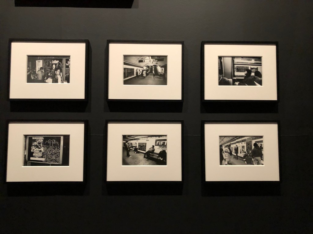
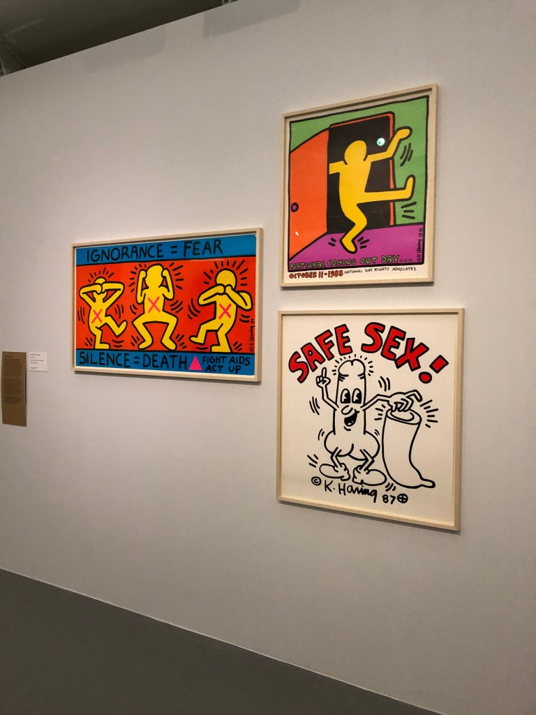
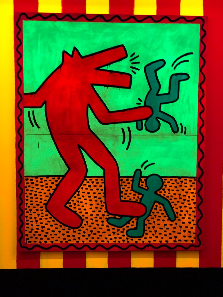
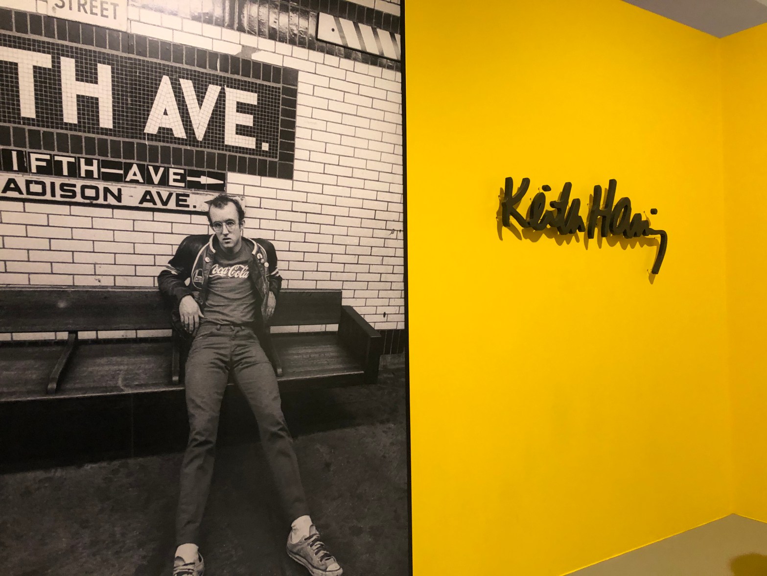
I visited the Tate gallery in Liverpool with college to see the Keith Haring exhibition. I really enjoyed his work. It was full of colour and imagination.

Weirdly enough this was my favourite thing that I saw in his exhibition. The photographs really stand out against the black background. I like the photographs themselves because they’re in black and white and they’re really interesting.
I found these pieces really clever. They’re informative but in a creative way. They’re colourful and stand out because of the way they’ve been created.
This has been painted with flourecent paint and was exhibited under UV lights. It was really interesting to see. Everything that was white looked like it was glow in the dark. It made my shoes look like they glow in the dark! I found this piece really funky. The atmosphere was so cool inside, there was music which made it better.
This is my inspired piece on Keith Haring. This work is about current affairs. The idea was to create something in cartoon style, like Keith Haring, that’s bold and in blocks of colour. I used acrylic paint because I find it hard to work with and feel like sometimes it can be messy. I feel as though it represents the issues that we are currently facing in a good way. It’s colourful and bold which means it will stand out to people a lot more than boring posters that have loads of writing. I do think it’s slightly messy and it’s not my best work however I did have fun making it.

Leave a comment

Design a site like this with WordPress.com
Get started